“Design succeeds when the user doesn’t have to think twice.”
— Steve Krug (Author of Don’t Make Me Think)
The Background
During my internship at Rumahweb, I worked on a visual redesign of the Domain & Hosting Order page. The objective of this project was to enhance the clarity, consistency, and overall usability of the ordering process through visual and structural improvements.
This redesign served as both an exploration of interface layout and an exercise in applying design principles to a real-world context.
01 — Overview
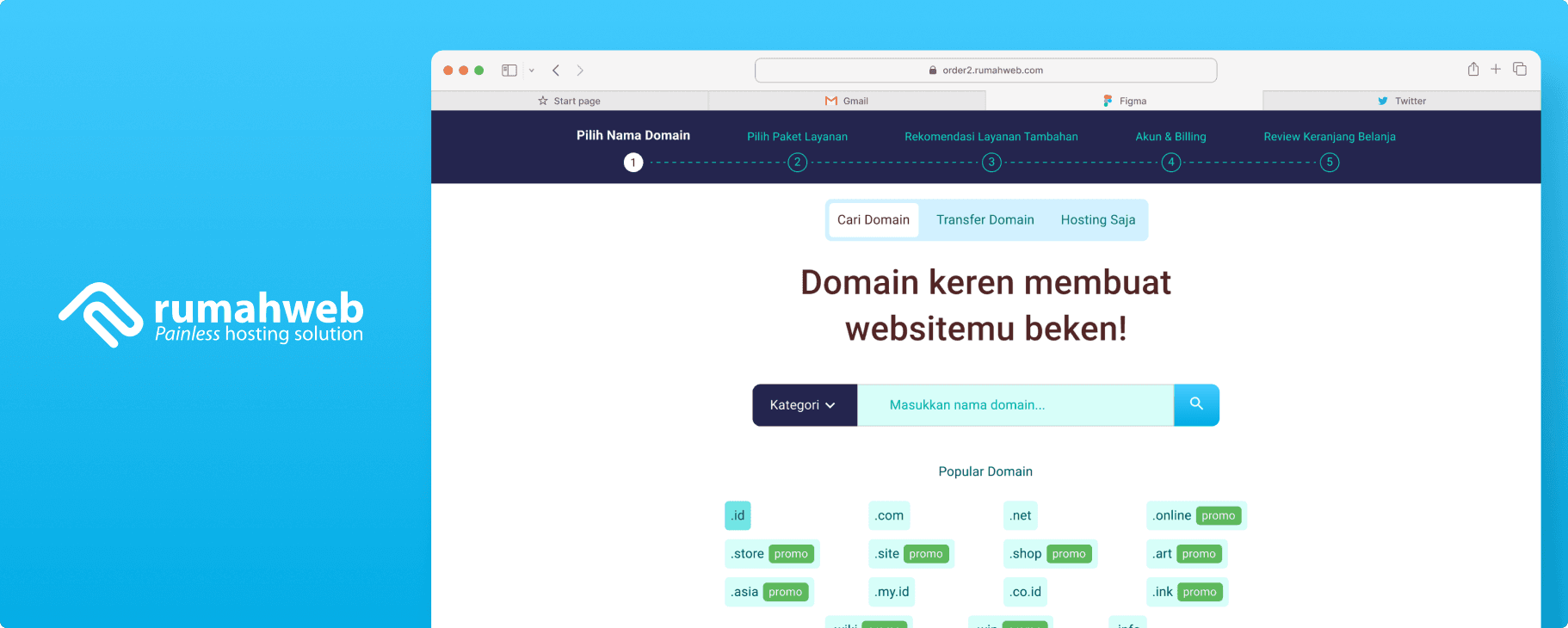
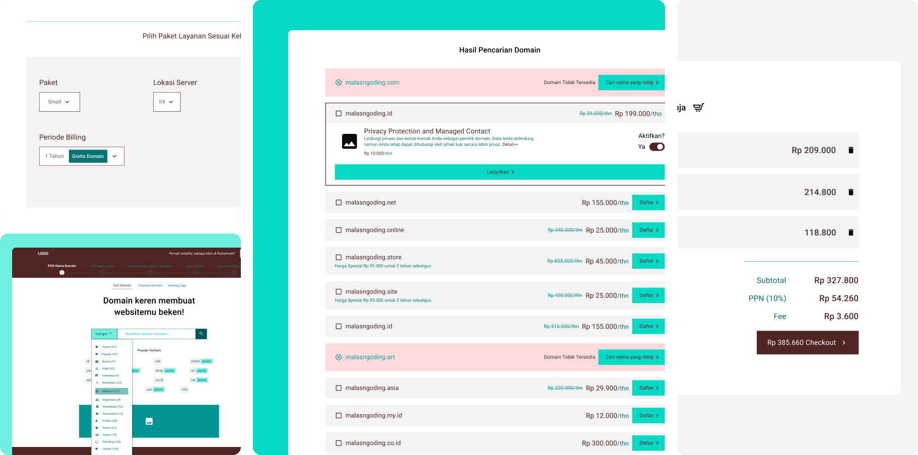
The Rumahweb order page is a key touchpoint where users purchase domains and hosting services.
However, the existing page had visual inconsistencies and a lack of clear hierarchy, which could make it harder for users to follow the order process efficiently.
My goal was to simplify the visual structure and improve the content organization, allowing users to move seamlessly from domain selection to checkout.
This project primarily focused on visual refinement and usability from an interface perspective.
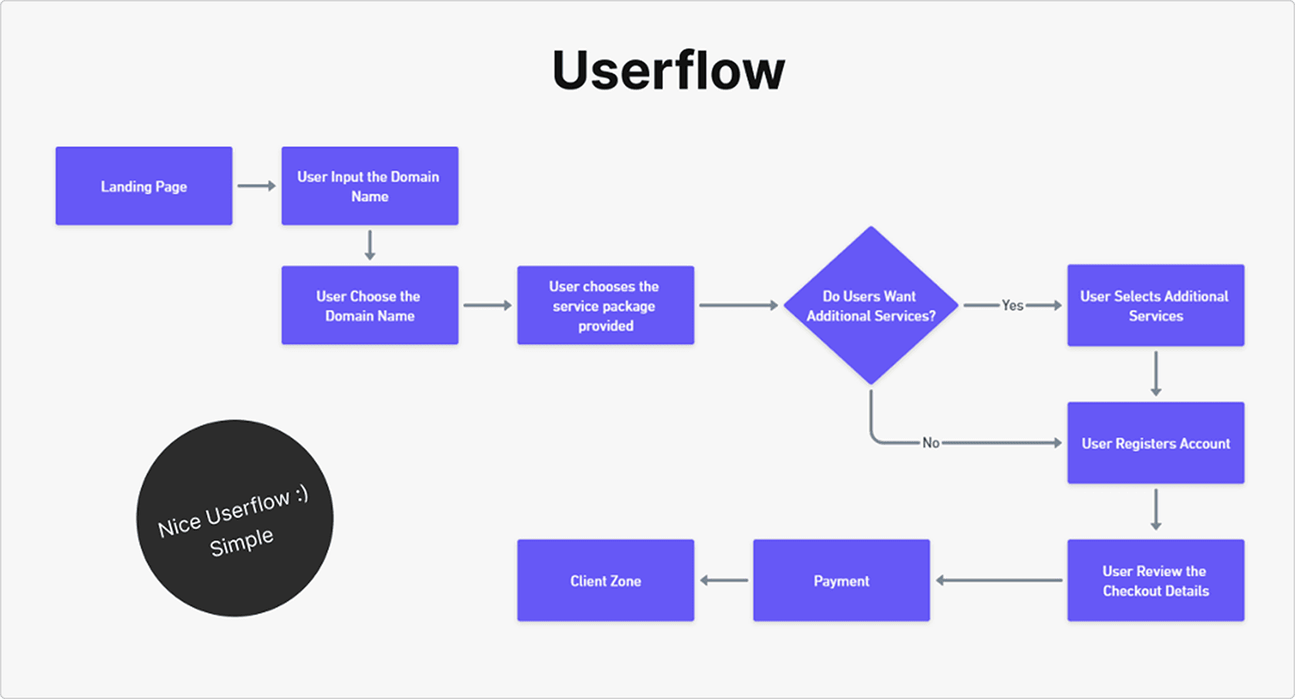
02 — Order Flow
Before moving into wireframing, I mapped out a simple order flow to understand the user journey within the system.
The goal of this flow was to ensure a clear step-by-step experience that guided users through each decision point without unnecessary friction. This structure became the foundation for designing intuitive page layouts in the next stage.
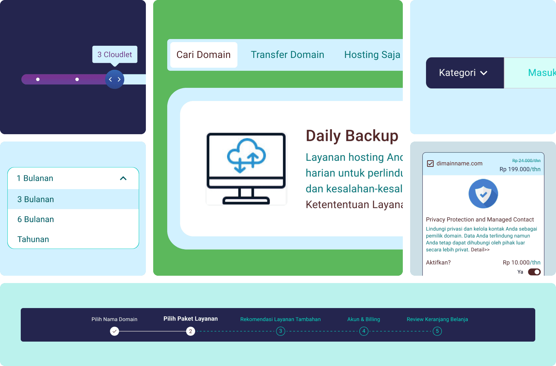
03 — Wireframe
Wireframes were developed to define information hierarchy and layout composition before finalizing the visuals.
At this stage, the focus was on determining where to place key components such as:
Domain search bar
Pricing and hosting options
CTA buttons and supporting information
Through the wireframes, I explored different ways to display plan comparisons and call-to-action emphasis, ensuring that users could quickly identify what to do next.
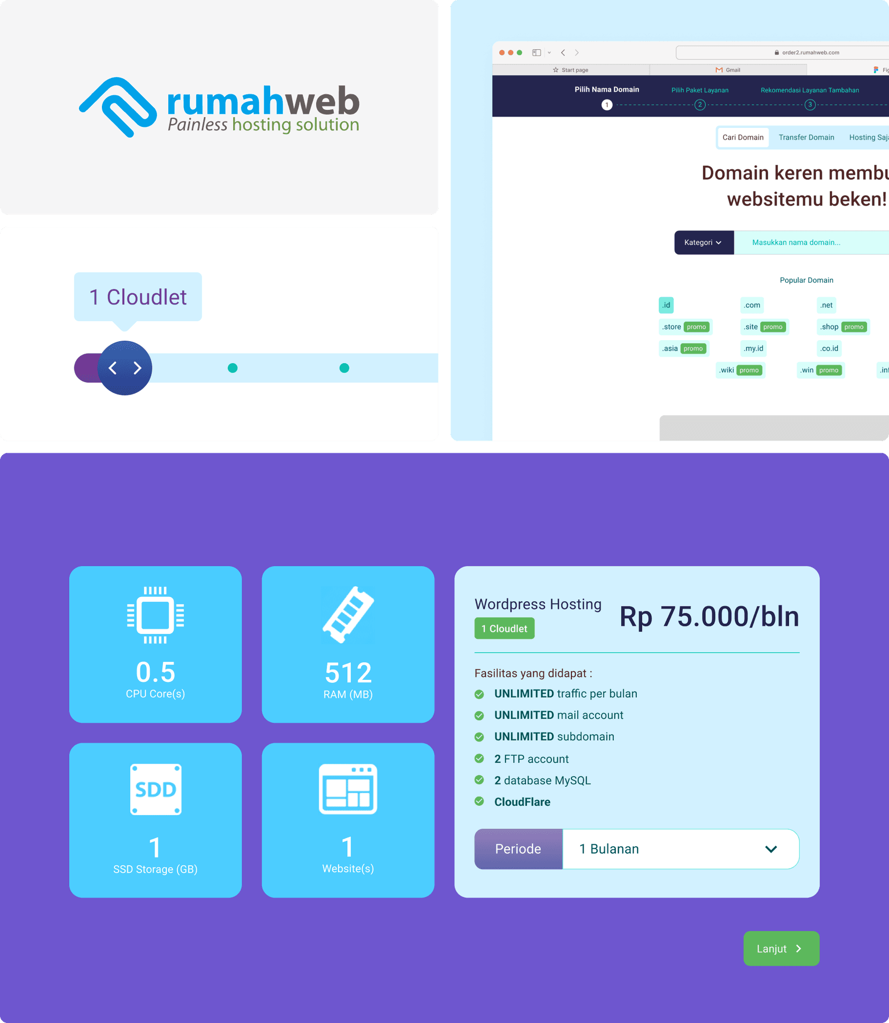
04 — Design System
A concise design system was created to maintain visual consistency and scalability throughout the page.
It included a structured set of design elements such as:
Typography scale for headings, descriptions, and labels
Color palette that aligns with Rumahweb’s brand identity
Button and input components for various interactive states
Etc
This design system served as a foundation for building the high-fidelity interface and ensured that every component aligned with a cohesive visual language.
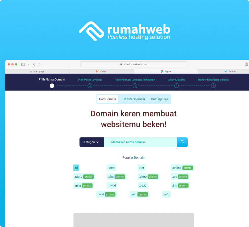
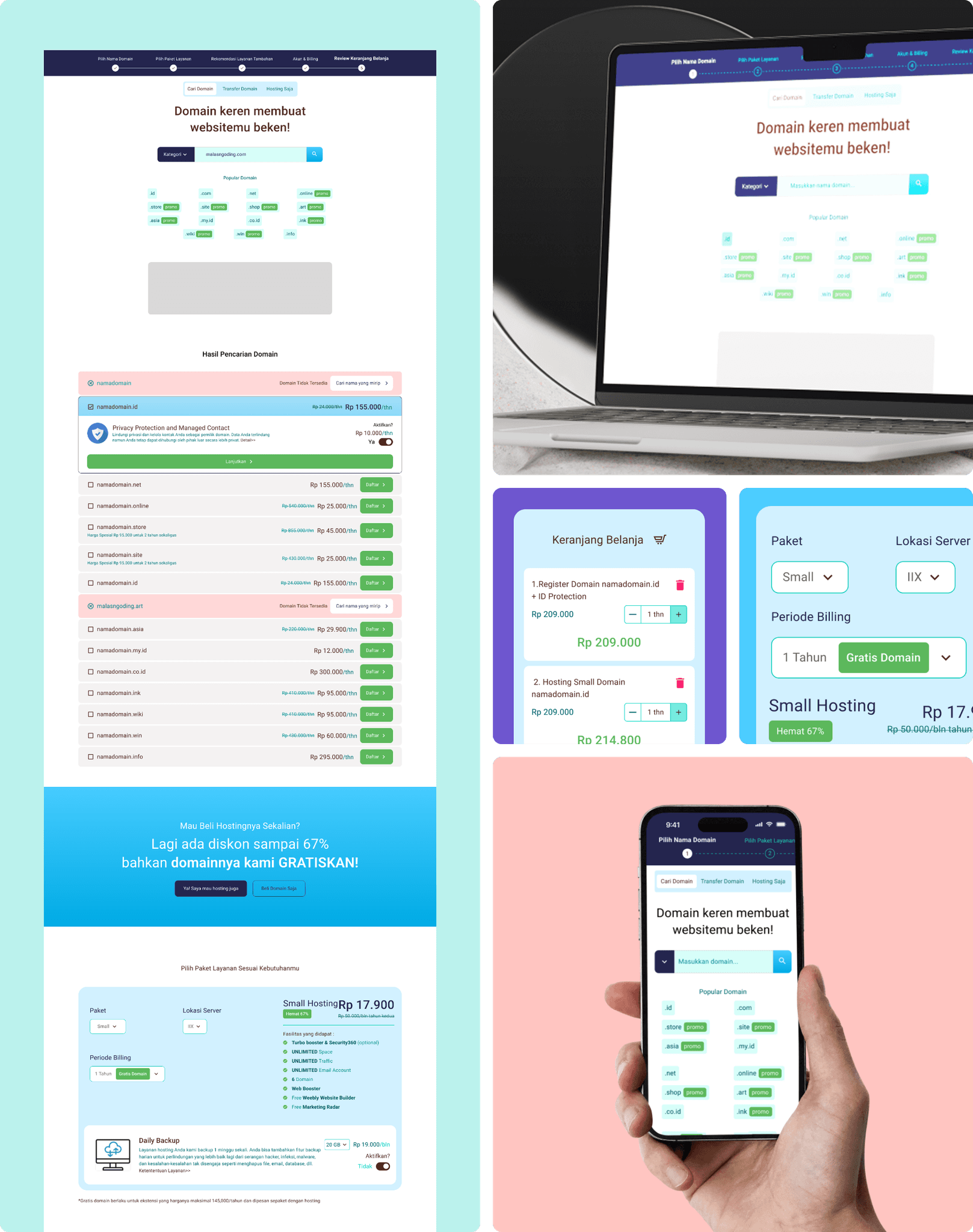
05 — High-Fidelity Design
In the final stage, I translated the wireframes and system guidelines into a high-fidelity interface that highlights visual clarity and improved usability.
The new layout features:
A cleaner, more modern design with stronger alignment and spacing
Simplified sections separating domain search, hosting selection, and checkout
Consistent visual cues to help users understand the progress of their order
By emphasizing whitespace and a clear visual rhythm, the redesign creates a smoother experience while staying true to Rumahweb’s branding and tone.
Reflection
This project reminded me that good UI design isn’t about adding more — it’s about making every element meaningful.
Through this redesign, I learned how structure, spacing, and consistency can quietly guide users toward completing their goals with confidence and ease.