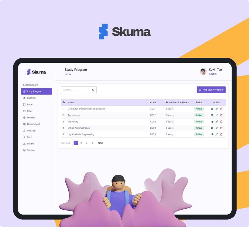
Skuma — Simplifying School Management with an Intuitive Dashboard
TL;DR (5-Second Read)
💡
Fast Overview
The dashboard helps school administrators manage departments, rooms, teachers, students, and parents — all in a simple and intuitive way.
It’s not just another dashboard — it’s a tool that helps schools breathe easier.
- Skuma
Background Story
When I worked at Kotakodelabs as a UI/UX Designer, one of the projects I was involved in was a web application for an LMS (Learning Management System), which focused on integrating learning for Admins, Teachers, and Students.
During this opportunity, I attempted to create a dashboard design from the Admin’s perspective, focusing on school management — including Departments, Buildings, Divisions, and even Parents and Students.
For this project, I collaborated with my friend Nuril Ichsan, who served as a UX Writer.
I used Radix UI Components from the Figma Community as the Design System — just in case a developer wants to bring it to life later.
Overview
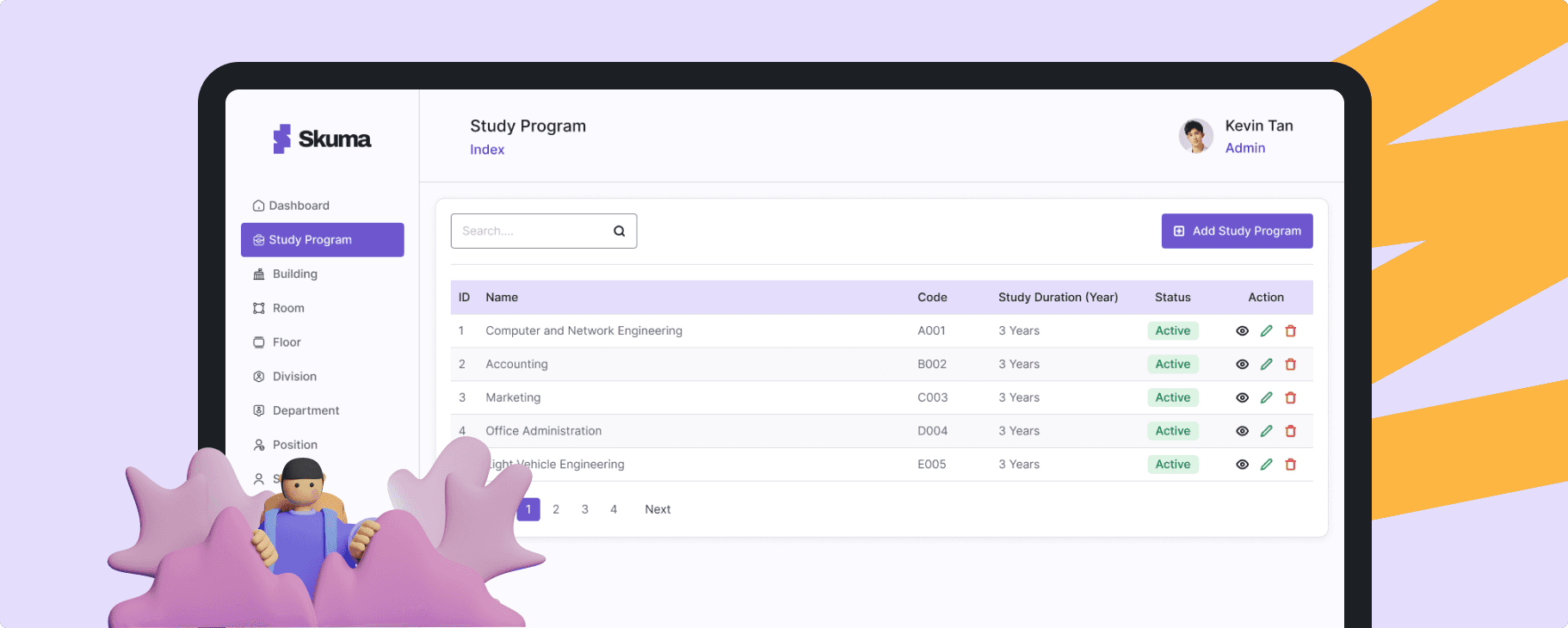
Skuma is a modern school management dashboard designed to help administrators manage daily operations — from departments, rooms, and staff to students and parents — all in one clean, intuitive interface.
Built with a focus on clarity, consistency, and efficiency, Skuma makes school management simple, visual, and effortless.
What Makes Skuma Different?
Focuses on ease of use for non-tech-savvy school admins
Uses a modular dashboard system so every data section feels familiar and organized
Designed with Radix UI components, ensuring both aesthetic consistency and dev-ready usability
Design Philosophy
Data-heavy doesn’t have to mean confusing.
Skuma was designed to simplify complex data structures through visual hierarchy, clean layouts, and component-based systems — helping admins find what they need in seconds.
Target Persona
🎓 School Administrators & Staff
👩🏫 Teachers and HR Teams managing academic data
🏫 Private & International Schools that require a scalable system
💻 Ages 25–45, comfortable with digital tools but prefer simple, intuitive dashboards
Core Features
Dashboard Overview: Key metrics at a glance — total students, active staff, room usage, etc.
Department & Building Management: Create and organize departments, rooms, and floors easily.
People Module: Manage students, parents, and staff in one place.
User Roles & Permissions: Keep data secure with layered access control.
Reusable UI Components: Built with Radix UI for consistency across screens.
Visual Direction
Skuma adopts a clean, calm, and modern aesthetic — using soft color palettes, clear typography, and intuitive spacing.
The goal: make the experience feel professional yet friendly, removing unnecessary visual noise that distracts from the data.
Benefits
Simplifies Management — Everything from departments to rooms in one dashboard.
Speeds Up Admin Workflows — Clean structure reduces time spent on repetitive tasks.
Reusable Components — Easier handoff and scalability for developers.
Improved Navigation — Logical flow ensures users never get lost.
Consistent UI System — Every page feels familiar, reducing cognitive load.
Why Skuma Matters
Skuma changes that by offering a unified, intuitive space — making admin tasks smoother, faster, and more visual.
It’s not just another dashboard — it’s a tool that helps schools breathe easier.
Now the Process, From Sketch to Launch 🚀
1. Discovery & Definition
First, I defined the project’s purpose: to simplify how school admins handle data—departments, buildings, rooms, staff, students, parents—so everything is manageable in one place.
I set key goals: create a clean interface, build a reusable component system, and make it dev-friendly.
2. Information Architecture & Flows
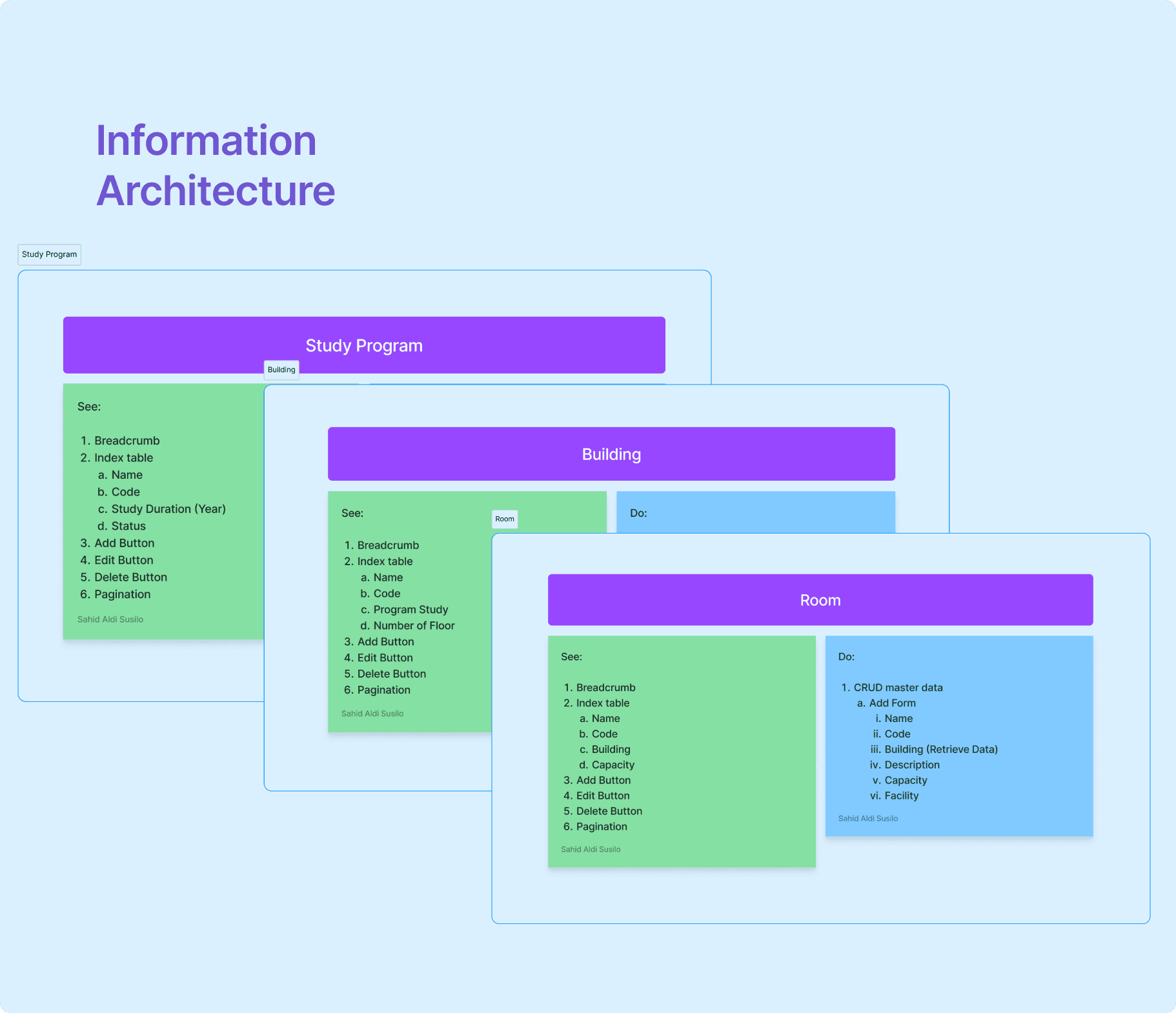
I mapped out all the data entities (study program, building, floor, room, division, department, position, staff, parent, student).
Then I laid out logical flows: adding new rooms, managing staff, linking students and parents. This helped me ensure the dashboard structure felt intuitive.
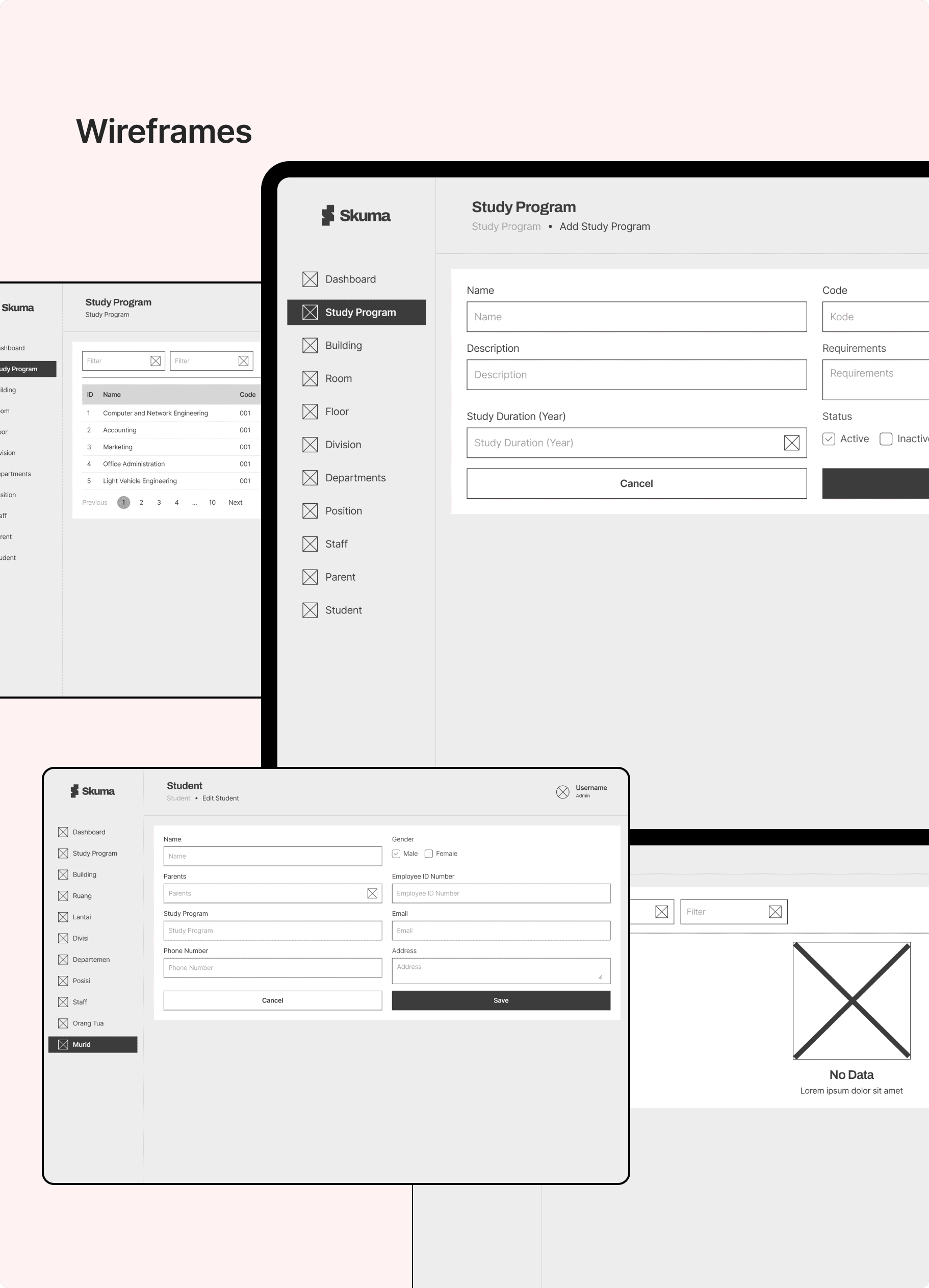
3. Wireframes
Next, I moved to wireframes: quick sketches to lock down layouts and user flows.
I focused on readability & clarity—tables with clear headers, forms that don’t overwhelm, action buttons that stand out.
4. Design System + Radix UI Components
To keep design consistent and implementation smooth, I built a design system based on Radix UI (Figma Community).
Defined tokens: colors, typography, spacing.
Created components: buttons, inputs, dropdowns, modals, tables.
Ensured accessibility and reusability for developers.
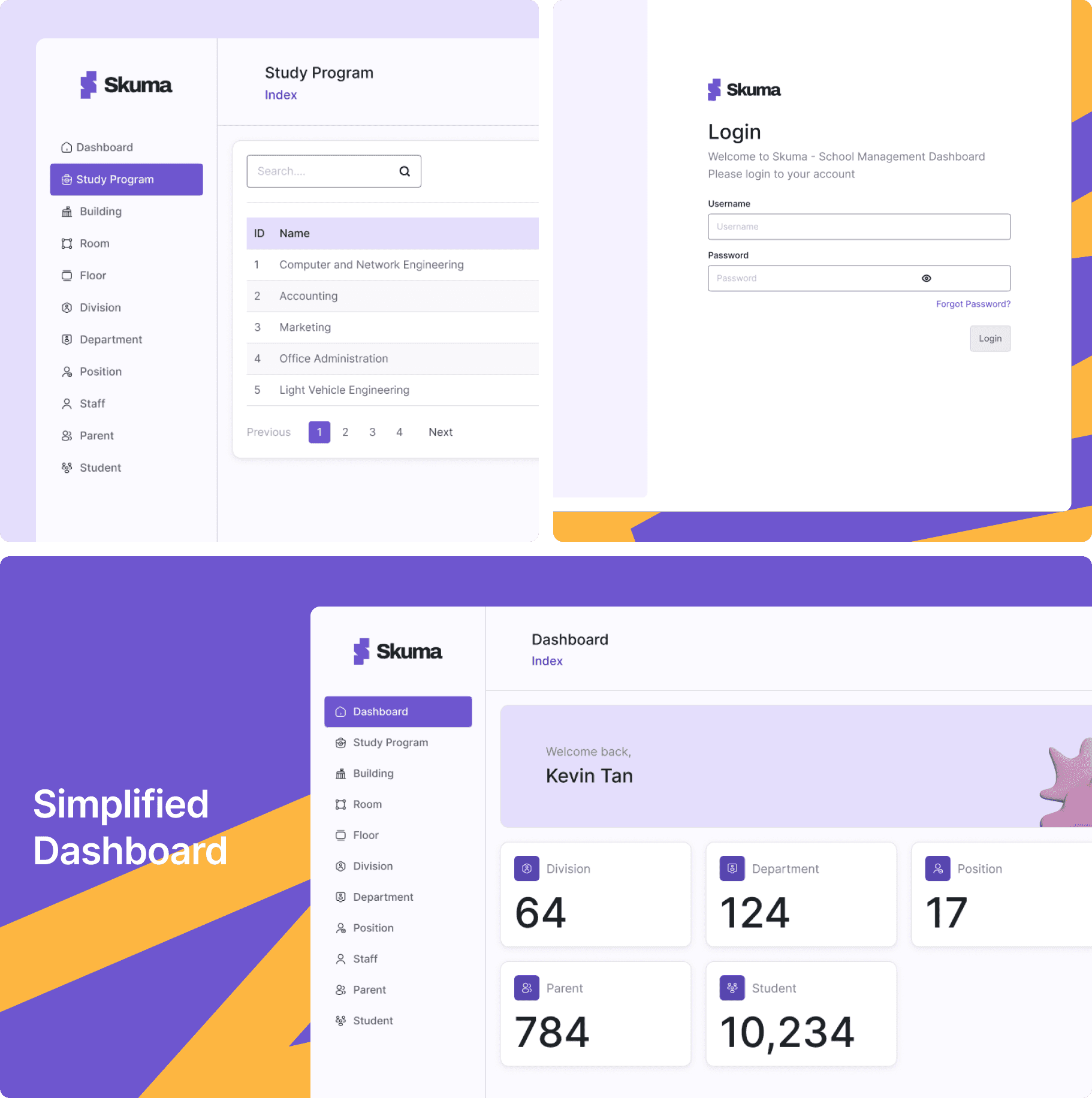
5. High-Fidelity Mockups & Visual Polish
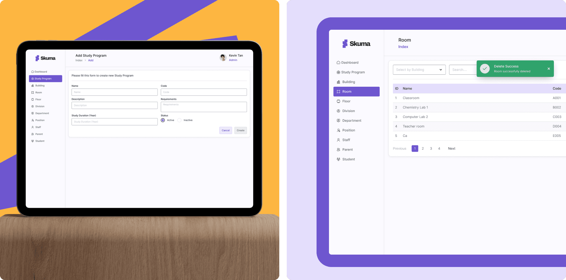
With the system ready, I designed high-fidelity screens: login, dashboard overview, study program module, building module, room page, etc.
I chose a soft but professional visual tone—spacious layouts, subtle colors, clear iconography—to make data work feel less heavy.
6. Prototype & Usability Check
I assembled a clickable prototype and ran a short usability check: testing core tasks like adding a student, assigning a room, editing staff details.
From feedback, I refined wording (“Save & close” instead of just “Submit”), added inline validations, and tweaked layout spacing for comfort.
✦ Conclusion
Skuma was designed with one clear mission — to simplify complex school management into a single, intuitive experience. By focusing on clarity, consistency, and usability, the platform empowers school administrators to manage data effortlessly without feeling overwhelmed.
Through a modular design system and well-structured information architecture, Skuma ensures scalability for future features while maintaining a seamless user experience.
This project reinforced my belief that great design isn’t about adding more, but about making what matters most—visible, clear, and easy to use.
Next Project
Next Project
Next Project
Next Project
© 2026 Sahid Aldi Susilo. All rights reserved.
Skuma — Simplifying School Management with an Intuitive Dashboard
TL;DR (5-Second Read)
💡
Fast Overview
The dashboard helps school administrators manage departments, rooms, teachers, students, and parents — all in a simple and intuitive way.
It’s not just another dashboard — it’s a tool that helps schools breathe easier.
- Skuma
Background Story
When I worked at Kotakodelabs as a UI/UX Designer, one of the projects I was involved in was a web application for an LMS (Learning Management System), which focused on integrating learning for Admins, Teachers, and Students.
During this opportunity, I attempted to create a dashboard design from the Admin’s perspective, focusing on school management — including Departments, Buildings, Divisions, and even Parents and Students.
For this project, I collaborated with my friend Nuril Ichsan, who served as a UX Writer.
I used Radix UI Components from the Figma Community as the Design System — just in case a developer wants to bring it to life later.
Overview
Skuma is a modern school management dashboard designed to help administrators manage daily operations — from departments, rooms, and staff to students and parents — all in one clean, intuitive interface.
Built with a focus on clarity, consistency, and efficiency, Skuma makes school management simple, visual, and effortless.
What Makes Skuma Different?
Focuses on ease of use for non-tech-savvy school admins
Uses a modular dashboard system so every data section feels familiar and organized
Designed with Radix UI components, ensuring both aesthetic consistency and dev-ready usability
Design Philosophy
Data-heavy doesn’t have to mean confusing.
Skuma was designed to simplify complex data structures through visual hierarchy, clean layouts, and component-based systems — helping admins find what they need in seconds.
Target Persona
🎓 School Administrators & Staff
👩🏫 Teachers and HR Teams managing academic data
🏫 Private & International Schools that require a scalable system
💻 Ages 25–45, comfortable with digital tools but prefer simple, intuitive dashboards
Core Features
Dashboard Overview: Key metrics at a glance — total students, active staff, room usage, etc.
Department & Building Management: Create and organize departments, rooms, and floors easily.
People Module: Manage students, parents, and staff in one place.
User Roles & Permissions: Keep data secure with layered access control.
Reusable UI Components: Built with Radix UI for consistency across screens.
Visual Direction
Skuma adopts a clean, calm, and modern aesthetic — using soft color palettes, clear typography, and intuitive spacing.
The goal: make the experience feel professional yet friendly, removing unnecessary visual noise that distracts from the data.
Benefits
Simplifies Management — Everything from departments to rooms in one dashboard.
Speeds Up Admin Workflows — Clean structure reduces time spent on repetitive tasks.
Reusable Components — Easier handoff and scalability for developers.
Improved Navigation — Logical flow ensures users never get lost.
Consistent UI System — Every page feels familiar, reducing cognitive load.
Why Skuma Matters
Skuma changes that by offering a unified, intuitive space — making admin tasks smoother, faster, and more visual.
It’s not just another dashboard — it’s a tool that helps schools breathe easier.
Now the Process, From Sketch to Launch 🚀
1. Discovery & Definition
First, I defined the project’s purpose: to simplify how school admins handle data—departments, buildings, rooms, staff, students, parents—so everything is manageable in one place.
I set key goals: create a clean interface, build a reusable component system, and make it dev-friendly.
2. Information Architecture & Flows
I mapped out all the data entities (study program, building, floor, room, division, department, position, staff, parent, student).
Then I laid out logical flows: adding new rooms, managing staff, linking students and parents. This helped me ensure the dashboard structure felt intuitive.
3. Wireframes
Next, I moved to wireframes: quick sketches to lock down layouts and user flows.
I focused on readability & clarity—tables with clear headers, forms that don’t overwhelm, action buttons that stand out.
4. Design System + Radix UI Components
To keep design consistent and implementation smooth, I built a design system based on Radix UI (Figma Community).
Defined tokens: colors, typography, spacing.
Created components: buttons, inputs, dropdowns, modals, tables.
Ensured accessibility and reusability for developers.
5. High-Fidelity Mockups & Visual Polish
With the system ready, I designed high-fidelity screens: login, dashboard overview, study program module, building module, room page, etc.
I chose a soft but professional visual tone—spacious layouts, subtle colors, clear iconography—to make data work feel less heavy.
6. Prototype & Usability Check
I assembled a clickable prototype and ran a short usability check: testing core tasks like adding a student, assigning a room, editing staff details.
From feedback, I refined wording (“Save & close” instead of just “Submit”), added inline validations, and tweaked layout spacing for comfort.
✦ Conclusion
Skuma was designed with one clear mission — to simplify complex school management into a single, intuitive experience. By focusing on clarity, consistency, and usability, the platform empowers school administrators to manage data effortlessly without feeling overwhelmed.
Through a modular design system and well-structured information architecture, Skuma ensures scalability for future features while maintaining a seamless user experience.
This project reinforced my belief that great design isn’t about adding more, but about making what matters most—visible, clear, and easy to use.
Next Project
Next Project
Next Project
Next Project
© 2026 Sahid Aldi Susilo. All rights reserved.
Skuma — Simplifying School Management with an Intuitive Dashboard
TL;DR (5-Second Read)
💡
Fast Overview
The dashboard helps school administrators manage departments, rooms, teachers, students, and parents — all in a simple and intuitive way.
It’s not just another dashboard — it’s a tool that helps schools breathe easier.
- Skuma
Background Story
When I worked at Kotakodelabs as a UI/UX Designer, one of the projects I was involved in was a web application for an LMS (Learning Management System), which focused on integrating learning for Admins, Teachers, and Students.
During this opportunity, I attempted to create a dashboard design from the Admin’s perspective, focusing on school management — including Departments, Buildings, Divisions, and even Parents and Students.
For this project, I collaborated with my friend Nuril Ichsan, who served as a UX Writer.
I used Radix UI Components from the Figma Community as the Design System — just in case a developer wants to bring it to life later.
Overview
Skuma is a modern school management dashboard designed to help administrators manage daily operations — from departments, rooms, and staff to students and parents — all in one clean, intuitive interface.
Built with a focus on clarity, consistency, and efficiency, Skuma makes school management simple, visual, and effortless.
What Makes Skuma Different?
Focuses on ease of use for non-tech-savvy school admins
Uses a modular dashboard system so every data section feels familiar and organized
Designed with Radix UI components, ensuring both aesthetic consistency and dev-ready usability
Design Philosophy
Data-heavy doesn’t have to mean confusing.
Skuma was designed to simplify complex data structures through visual hierarchy, clean layouts, and component-based systems — helping admins find what they need in seconds.
Target Persona
🎓 School Administrators & Staff
👩🏫 Teachers and HR Teams managing academic data
🏫 Private & International Schools that require a scalable system
💻 Ages 25–45, comfortable with digital tools but prefer simple, intuitive dashboards
Core Features
Dashboard Overview: Key metrics at a glance — total students, active staff, room usage, etc.
Department & Building Management: Create and organize departments, rooms, and floors easily.
People Module: Manage students, parents, and staff in one place.
User Roles & Permissions: Keep data secure with layered access control.
Reusable UI Components: Built with Radix UI for consistency across screens.
Visual Direction
Skuma adopts a clean, calm, and modern aesthetic — using soft color palettes, clear typography, and intuitive spacing.
The goal: make the experience feel professional yet friendly, removing unnecessary visual noise that distracts from the data.
Benefits
Simplifies Management — Everything from departments to rooms in one dashboard.
Speeds Up Admin Workflows — Clean structure reduces time spent on repetitive tasks.
Reusable Components — Easier handoff and scalability for developers.
Improved Navigation — Logical flow ensures users never get lost.
Consistent UI System — Every page feels familiar, reducing cognitive load.
Why Skuma Matters
Skuma changes that by offering a unified, intuitive space — making admin tasks smoother, faster, and more visual.
It’s not just another dashboard — it’s a tool that helps schools breathe easier.
Now the Process, From Sketch to Launch 🚀
1. Discovery & Definition
First, I defined the project’s purpose: to simplify how school admins handle data—departments, buildings, rooms, staff, students, parents—so everything is manageable in one place.
I set key goals: create a clean interface, build a reusable component system, and make it dev-friendly.
2. Information Architecture & Flows
I mapped out all the data entities (study program, building, floor, room, division, department, position, staff, parent, student).
Then I laid out logical flows: adding new rooms, managing staff, linking students and parents. This helped me ensure the dashboard structure felt intuitive.
3. Wireframes
Next, I moved to wireframes: quick sketches to lock down layouts and user flows.
I focused on readability & clarity—tables with clear headers, forms that don’t overwhelm, action buttons that stand out.
4. Design System + Radix UI Components
To keep design consistent and implementation smooth, I built a design system based on Radix UI (Figma Community).
Defined tokens: colors, typography, spacing.
Created components: buttons, inputs, dropdowns, modals, tables.
Ensured accessibility and reusability for developers.
5. High-Fidelity Mockups & Visual Polish
With the system ready, I designed high-fidelity screens: login, dashboard overview, study program module, building module, room page, etc.
I chose a soft but professional visual tone—spacious layouts, subtle colors, clear iconography—to make data work feel less heavy.
6. Prototype & Usability Check
I assembled a clickable prototype and ran a short usability check: testing core tasks like adding a student, assigning a room, editing staff details.
From feedback, I refined wording (“Save & close” instead of just “Submit”), added inline validations, and tweaked layout spacing for comfort.
✦ Conclusion
Skuma was designed with one clear mission — to simplify complex school management into a single, intuitive experience. By focusing on clarity, consistency, and usability, the platform empowers school administrators to manage data effortlessly without feeling overwhelmed.
Through a modular design system and well-structured information architecture, Skuma ensures scalability for future features while maintaining a seamless user experience.
This project reinforced my belief that great design isn’t about adding more, but about making what matters most—visible, clear, and easy to use.
Next Project
Next Project
Next Project
Next Project
© 2026 Sahid Aldi Susilo. All rights reserved.
Skuma — Simplifying School Management with an Intuitive Dashboard
TL;DR (5-Second Read)
💡
Fast Overview
The dashboard helps school administrators manage departments, rooms, teachers, students, and parents — all in a simple and intuitive way.
It’s not just another dashboard — it’s a tool that helps schools breathe easier.
- Skuma
Background Story
When I worked at Kotakodelabs as a UI/UX Designer, one of the projects I was involved in was a web application for an LMS (Learning Management System), which focused on integrating learning for Admins, Teachers, and Students.
During this opportunity, I attempted to create a dashboard design from the Admin’s perspective, focusing on school management — including Departments, Buildings, Divisions, and even Parents and Students.
For this project, I collaborated with my friend Nuril Ichsan, who served as a UX Writer.
I used Radix UI Components from the Figma Community as the Design System — just in case a developer wants to bring it to life later.
Overview
Skuma is a modern school management dashboard designed to help administrators manage daily operations — from departments, rooms, and staff to students and parents — all in one clean, intuitive interface.
Built with a focus on clarity, consistency, and efficiency, Skuma makes school management simple, visual, and effortless.
What Makes Skuma Different?
Focuses on ease of use for non-tech-savvy school admins
Uses a modular dashboard system so every data section feels familiar and organized
Designed with Radix UI components, ensuring both aesthetic consistency and dev-ready usability
Design Philosophy
Data-heavy doesn’t have to mean confusing.
Skuma was designed to simplify complex data structures through visual hierarchy, clean layouts, and component-based systems — helping admins find what they need in seconds.
Target Persona
🎓 School Administrators & Staff
👩🏫 Teachers and HR Teams managing academic data
🏫 Private & International Schools that require a scalable system
💻 Ages 25–45, comfortable with digital tools but prefer simple, intuitive dashboards
Core Features
Dashboard Overview: Key metrics at a glance — total students, active staff, room usage, etc.
Department & Building Management: Create and organize departments, rooms, and floors easily.
People Module: Manage students, parents, and staff in one place.
User Roles & Permissions: Keep data secure with layered access control.
Reusable UI Components: Built with Radix UI for consistency across screens.
Visual Direction
Skuma adopts a clean, calm, and modern aesthetic — using soft color palettes, clear typography, and intuitive spacing.
The goal: make the experience feel professional yet friendly, removing unnecessary visual noise that distracts from the data.
Benefits
Simplifies Management — Everything from departments to rooms in one dashboard.
Speeds Up Admin Workflows — Clean structure reduces time spent on repetitive tasks.
Reusable Components — Easier handoff and scalability for developers.
Improved Navigation — Logical flow ensures users never get lost.
Consistent UI System — Every page feels familiar, reducing cognitive load.
Why Skuma Matters
Skuma changes that by offering a unified, intuitive space — making admin tasks smoother, faster, and more visual.
It’s not just another dashboard — it’s a tool that helps schools breathe easier.
Now the Process, From Sketch to Launch 🚀
1. Discovery & Definition
First, I defined the project’s purpose: to simplify how school admins handle data—departments, buildings, rooms, staff, students, parents—so everything is manageable in one place.
I set key goals: create a clean interface, build a reusable component system, and make it dev-friendly.
2. Information Architecture & Flows
I mapped out all the data entities (study program, building, floor, room, division, department, position, staff, parent, student).
Then I laid out logical flows: adding new rooms, managing staff, linking students and parents. This helped me ensure the dashboard structure felt intuitive.
3. Wireframes
Next, I moved to wireframes: quick sketches to lock down layouts and user flows.
I focused on readability & clarity—tables with clear headers, forms that don’t overwhelm, action buttons that stand out.
4. Design System + Radix UI Components
To keep design consistent and implementation smooth, I built a design system based on Radix UI (Figma Community).
Defined tokens: colors, typography, spacing.
Created components: buttons, inputs, dropdowns, modals, tables.
Ensured accessibility and reusability for developers.
5. High-Fidelity Mockups & Visual Polish
With the system ready, I designed high-fidelity screens: login, dashboard overview, study program module, building module, room page, etc.
I chose a soft but professional visual tone—spacious layouts, subtle colors, clear iconography—to make data work feel less heavy.
6. Prototype & Usability Check
I assembled a clickable prototype and ran a short usability check: testing core tasks like adding a student, assigning a room, editing staff details.
From feedback, I refined wording (“Save & close” instead of just “Submit”), added inline validations, and tweaked layout spacing for comfort.
✦ Conclusion
Skuma was designed with one clear mission — to simplify complex school management into a single, intuitive experience. By focusing on clarity, consistency, and usability, the platform empowers school administrators to manage data effortlessly without feeling overwhelmed.
Through a modular design system and well-structured information architecture, Skuma ensures scalability for future features while maintaining a seamless user experience.
This project reinforced my belief that great design isn’t about adding more, but about making what matters most—visible, clear, and easy to use.
Next Project
Next Project
Next Project
Next Project
© 2026 Sahid Aldi Susilo. All rights reserved.